


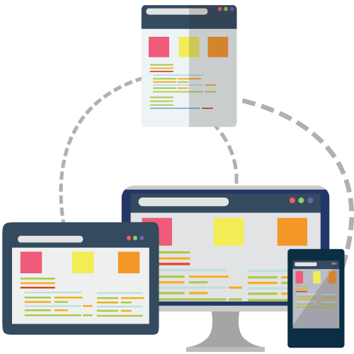
Responsive web design gives you an authentics approach about design & development that gives proven results about users behavior & environment based on screen size, platform and orientation. More to this, it consists of a mix of flexible grids and layouts, images and an intelligent use of CSS media queries.
Fluid Screen layout
Responsive images & Lucid textures
Bootstrap, Media queries & easily manageable
Responsive designs for compatibility of every device.
Remarkable user experience
Navigation tags & proper Testing
Remarkable visual represntation
Availability of latest technologies

To make attractive screen appearance and feel your design youthful

Remarkable, Consistent, lucid use of Navigation tags for user convenience

Have a great quick fix and a good start to responsive images, image resolution as per user considerations

Affordable and credible services for customers with competitive prices

Fully Tested through Standardised software development to make sustainable appearance

We serve as per the customer requirement to meet their satisfaction & provide the services that ameliorate values to user's life